728x90
반응형
제가 CSS를 처음 입문할 때 도움이 되었던 grid 속성 게임이에요
어려운 부분이 있으면 제 답안을 참고해서 풀어주세요😊
단계 1 of 28
grid-column-start: 3;
단계 2 of 28
grid-column-start: 5;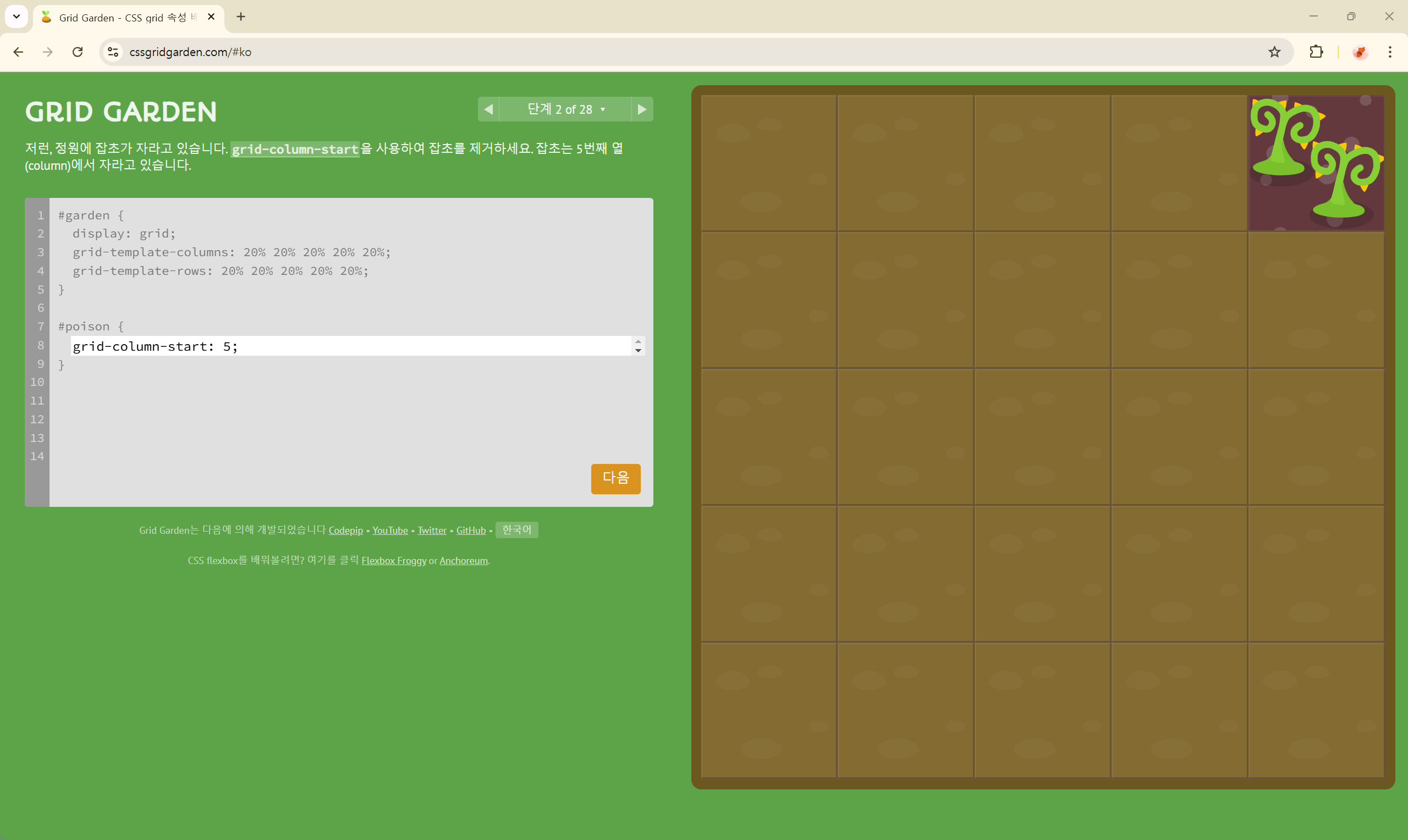
단계 3 of 28
grid-column-end: 4;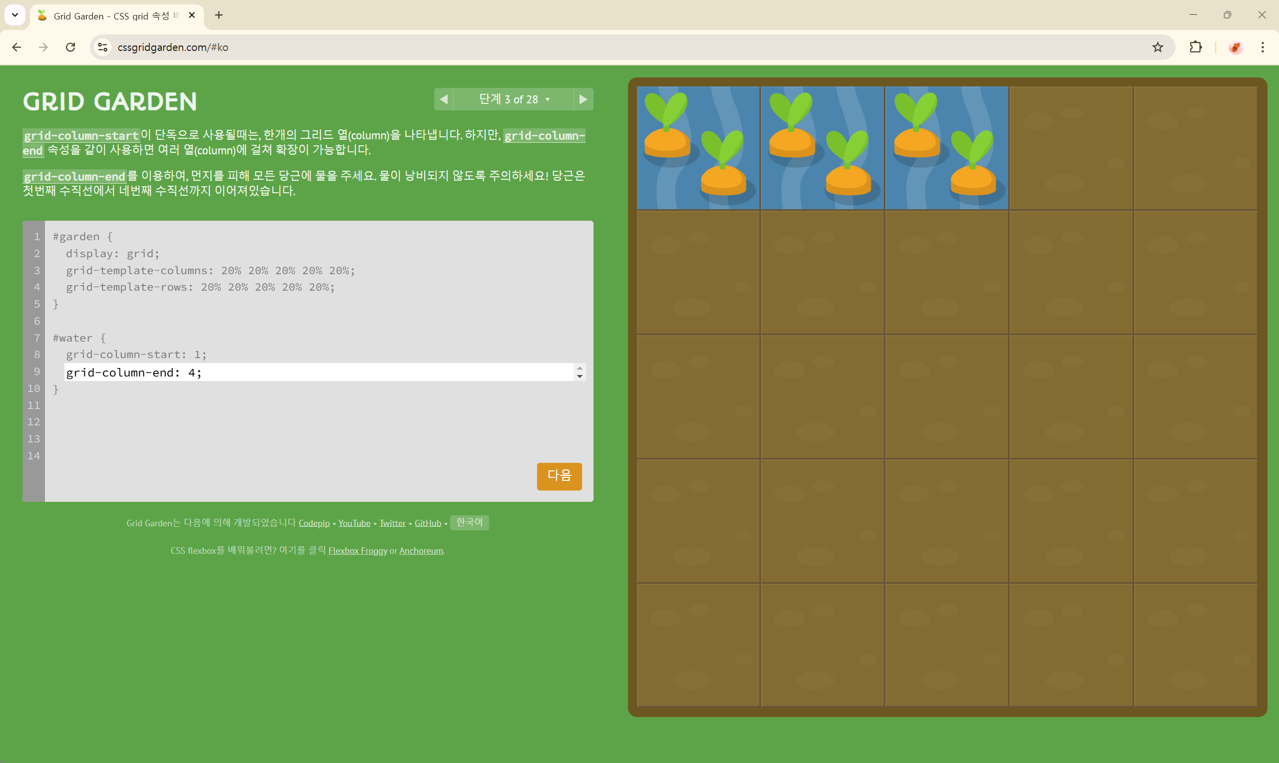
단계 4 of 28
grid-column-end: 2;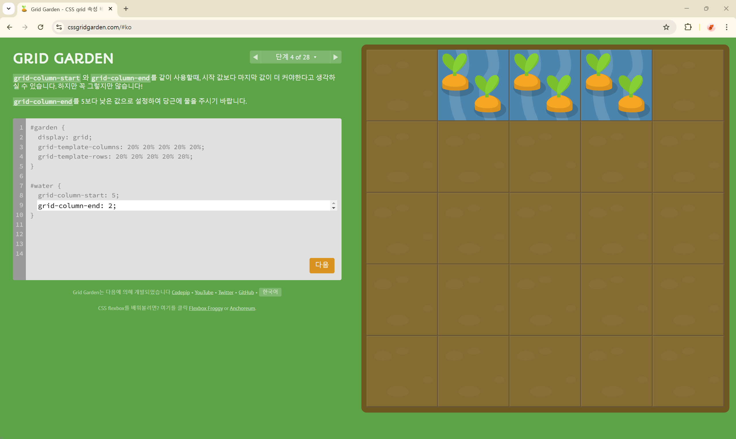
단계 5 of 28
grid-column-end: -2;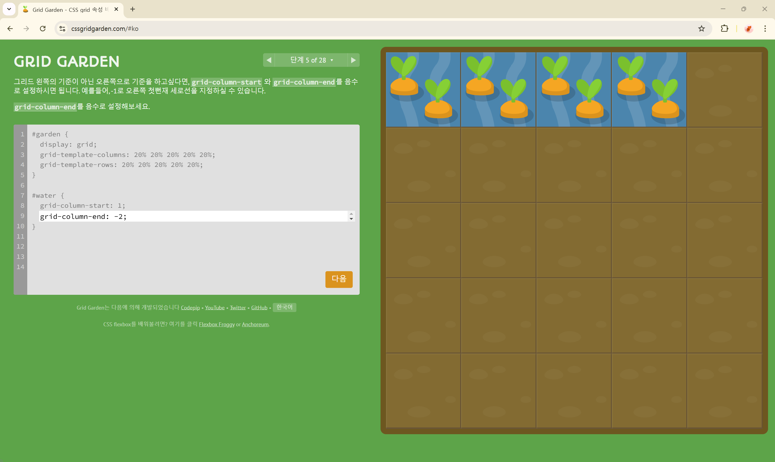
단계 6 of 28
grid-column-start: -3;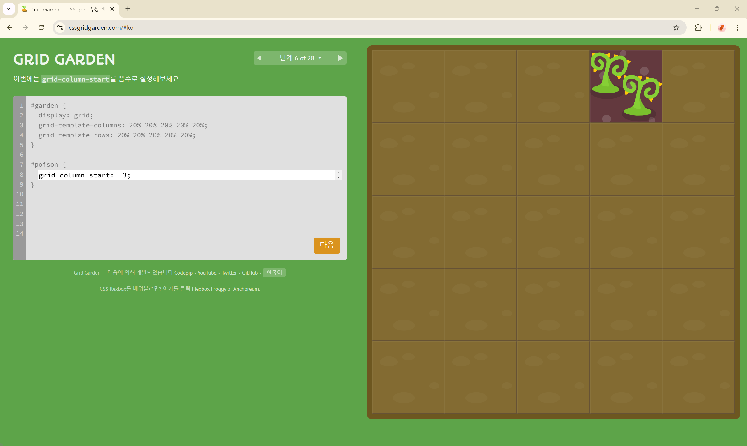
단계 7 of 28
grid-column-end: span 2;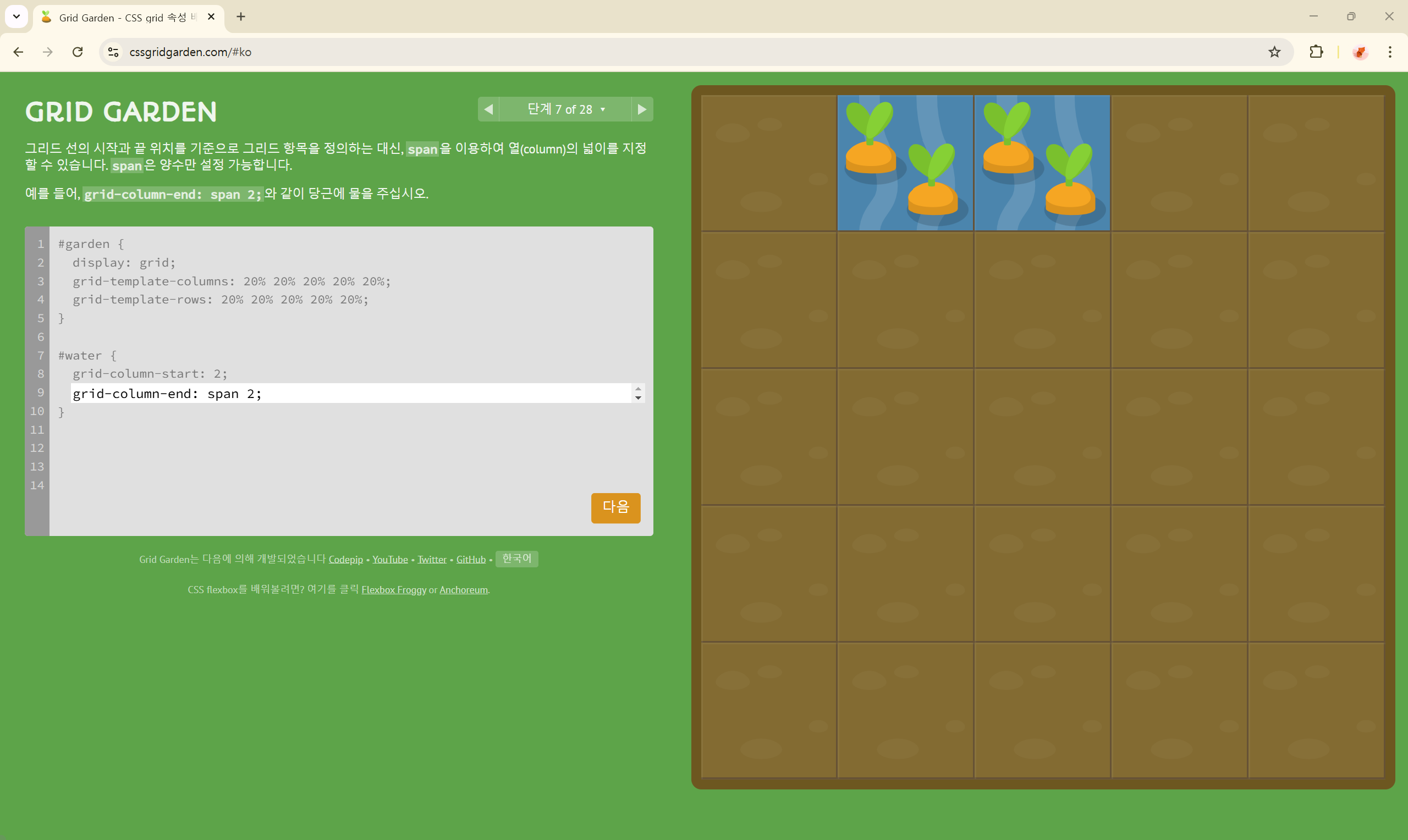
단계 8 of 28
grid-column-end: span 5;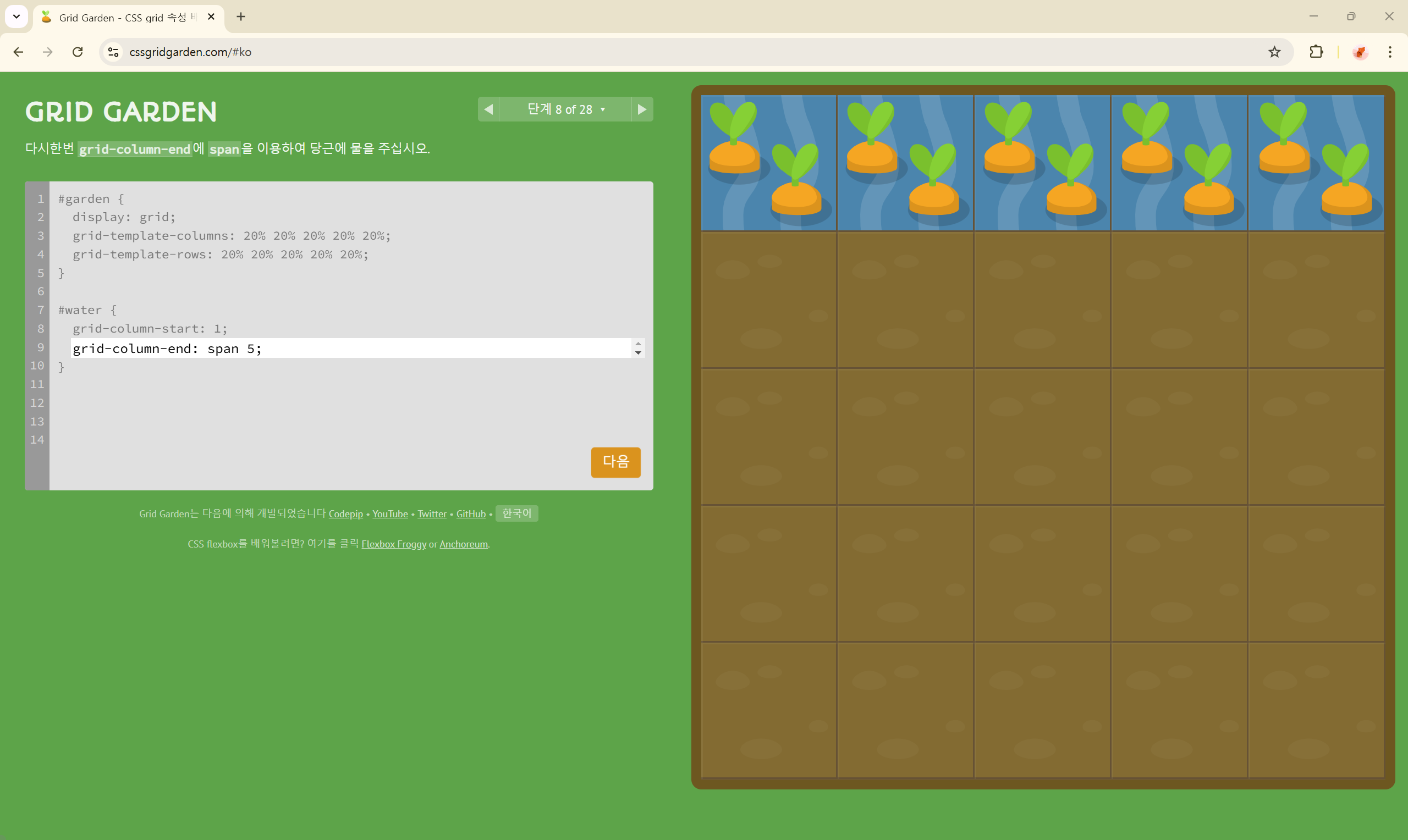
단계 9 of 28
grid-column-start: 3;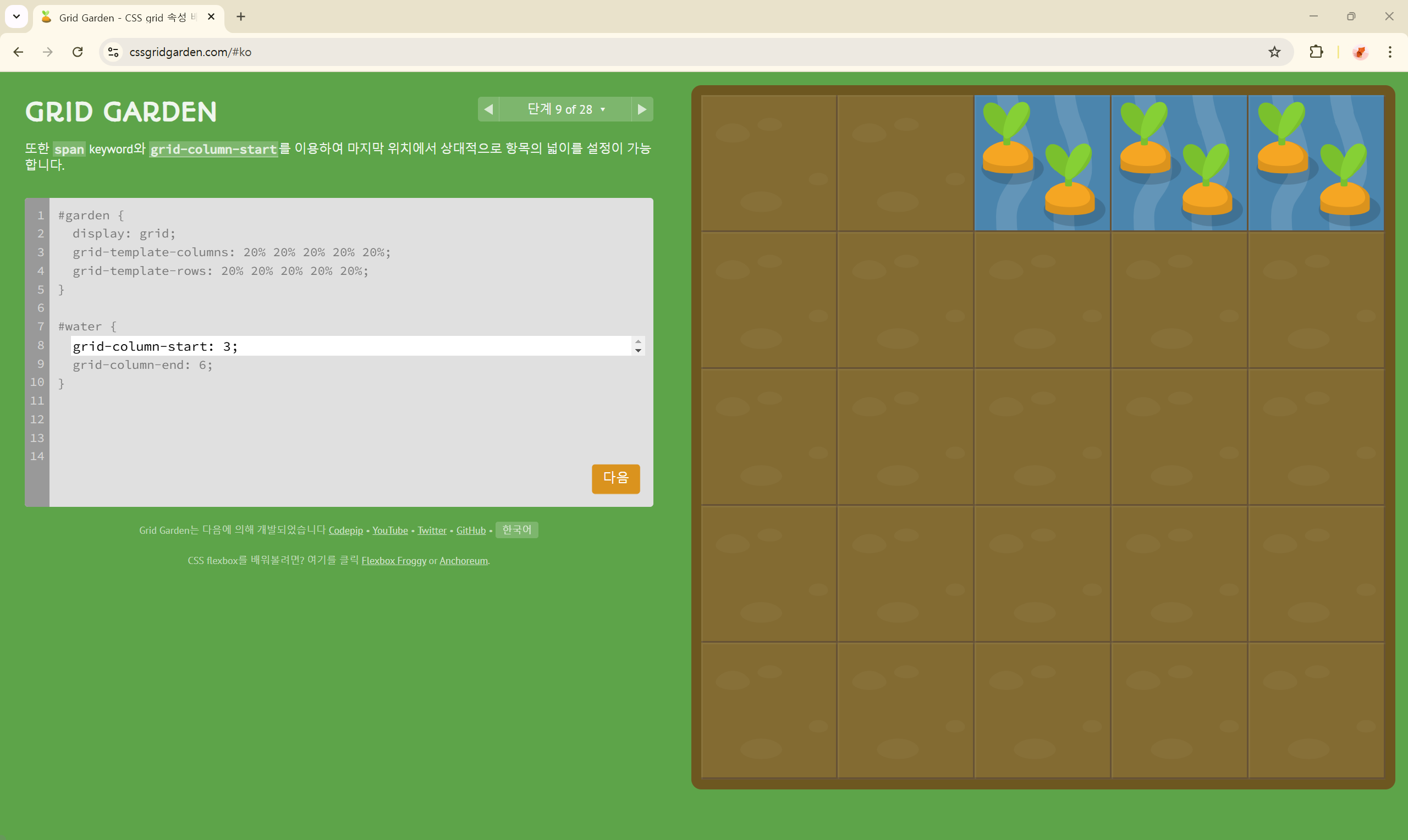
단계 10 of 28
grid-column: 4 / 6;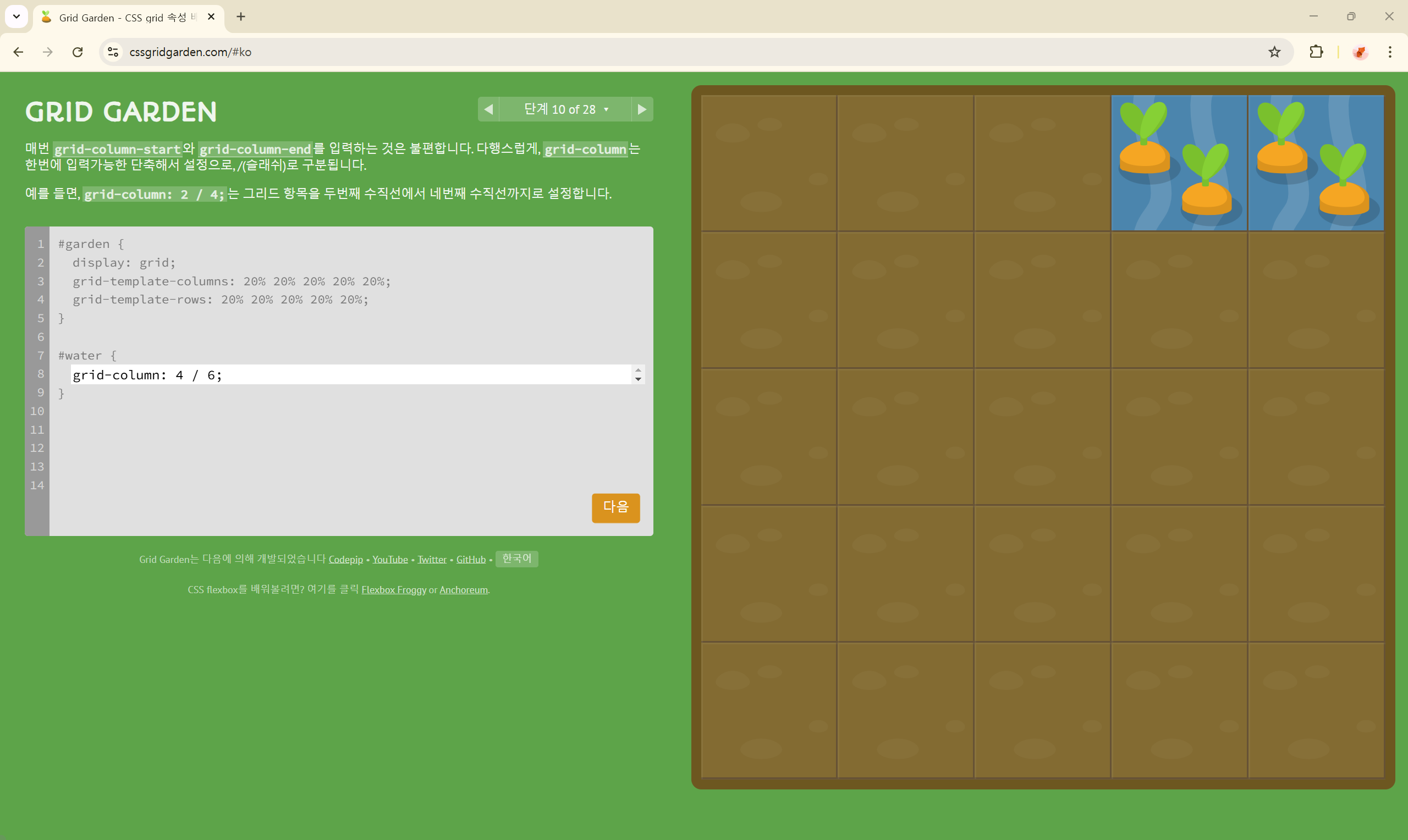
단계 11 of 28
grid-column: 2 / span 3;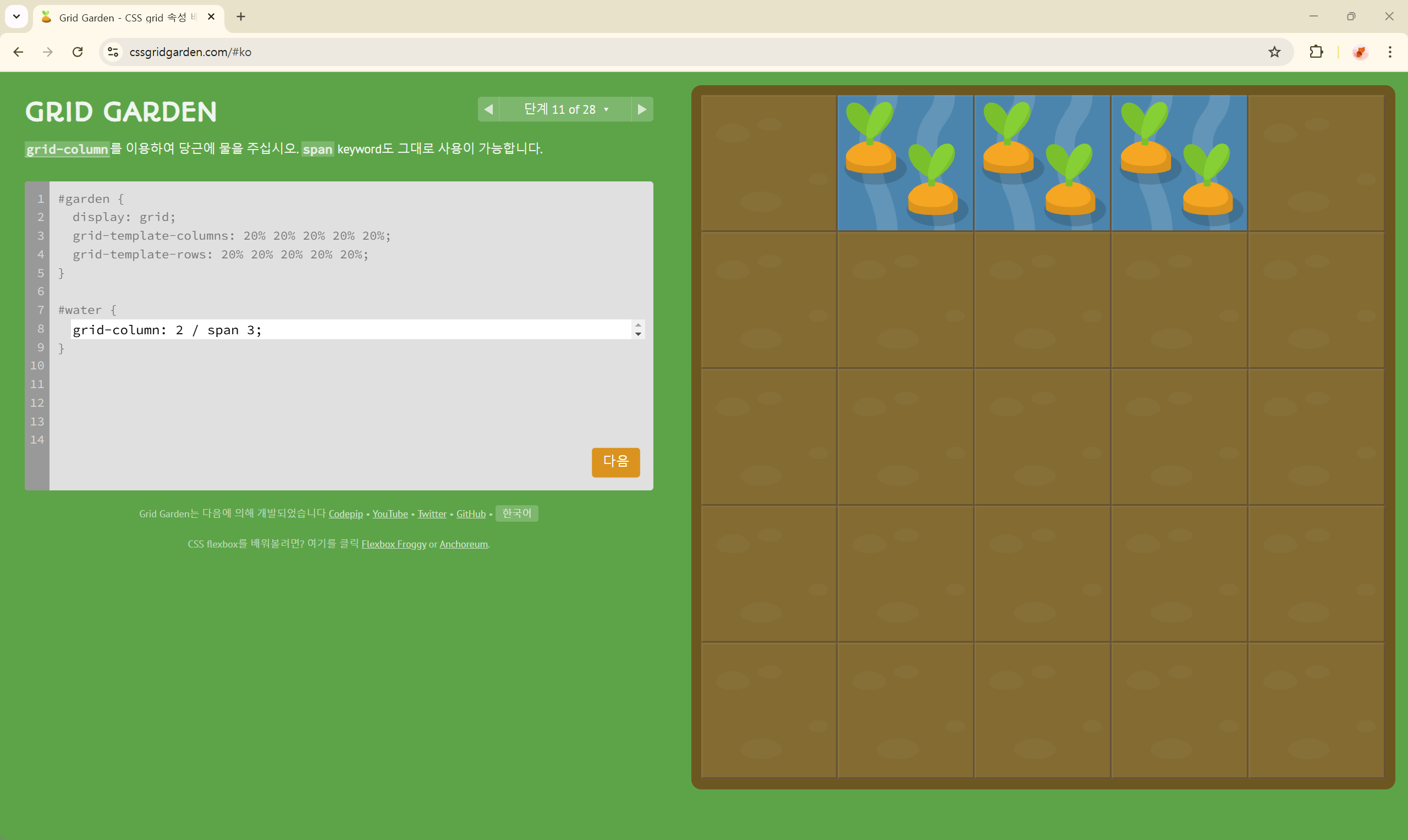
단계 12 of 28
grid-row-start: 3;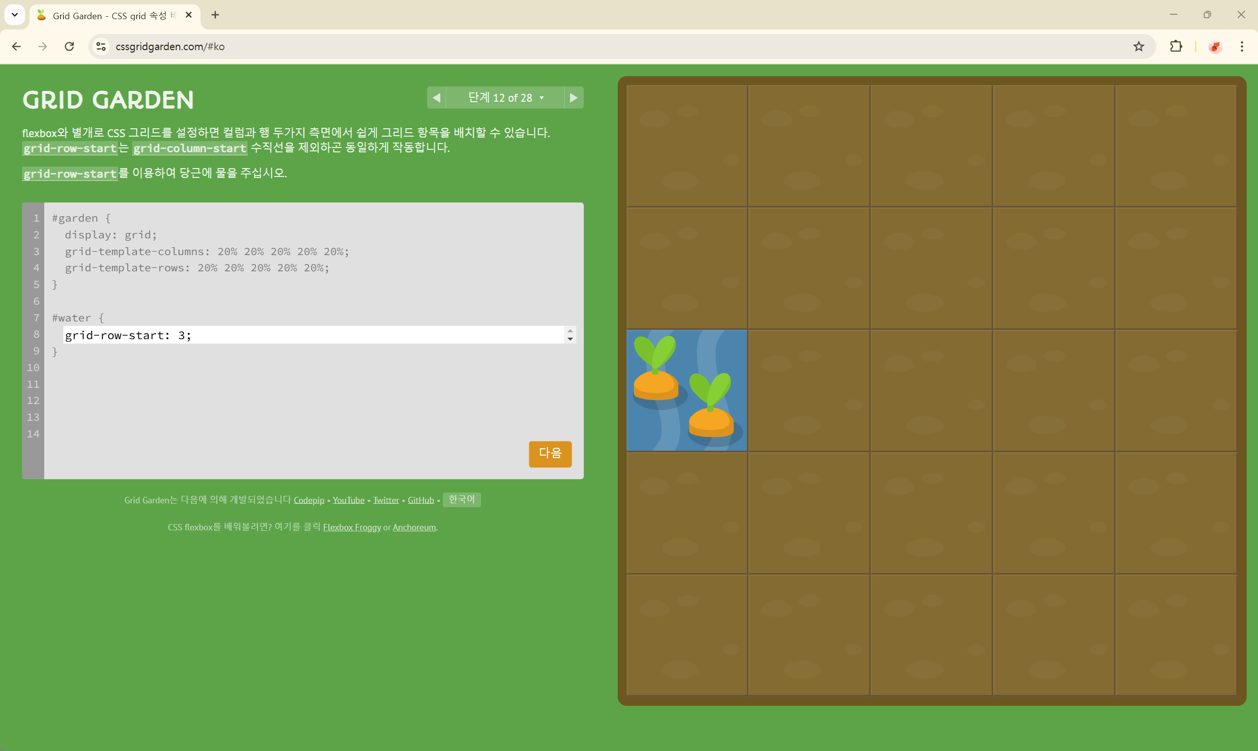
단계 13 of 28
grid-row: 3 / 6;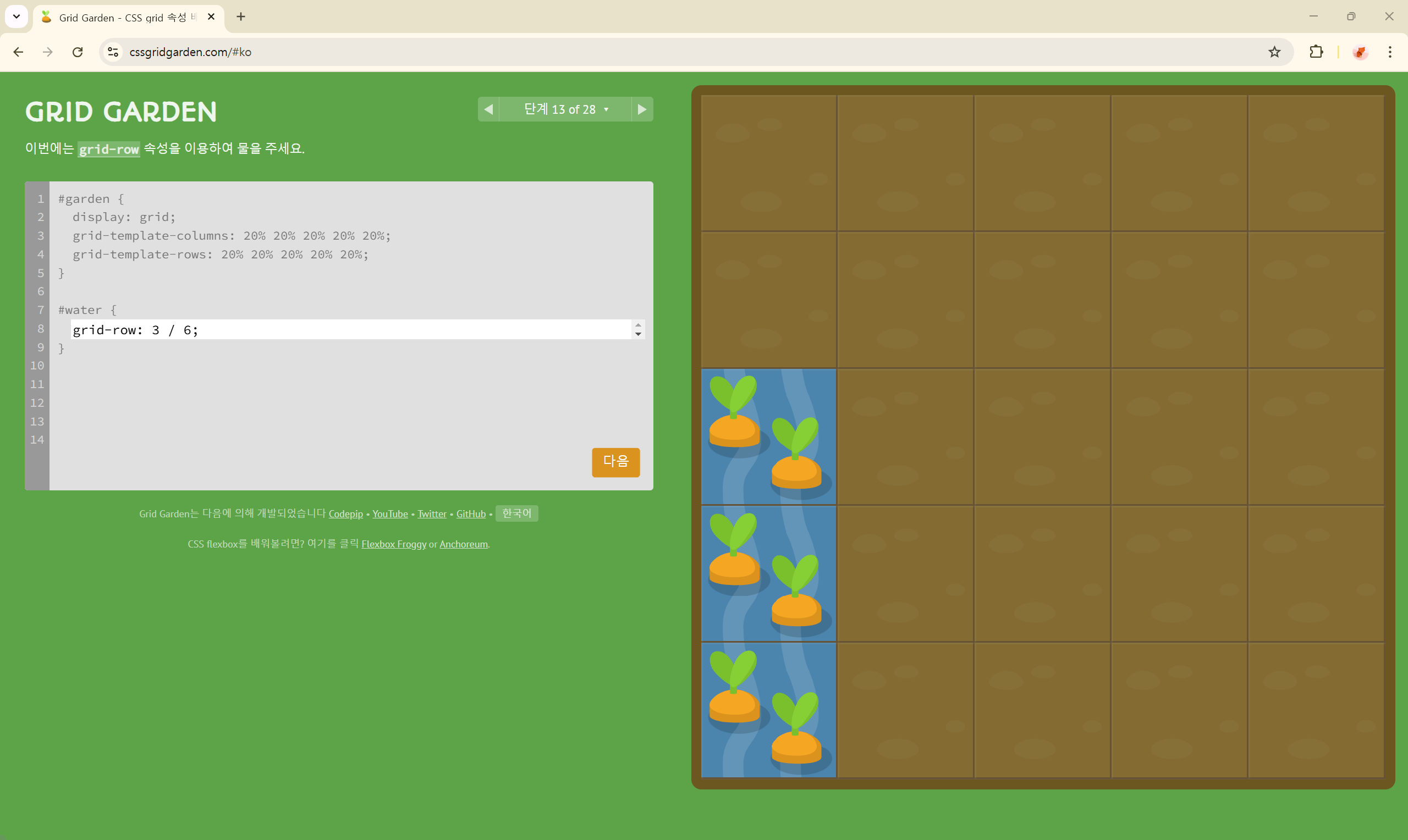
단계 14 of 28
grid-column: 2;
grid-row: 5;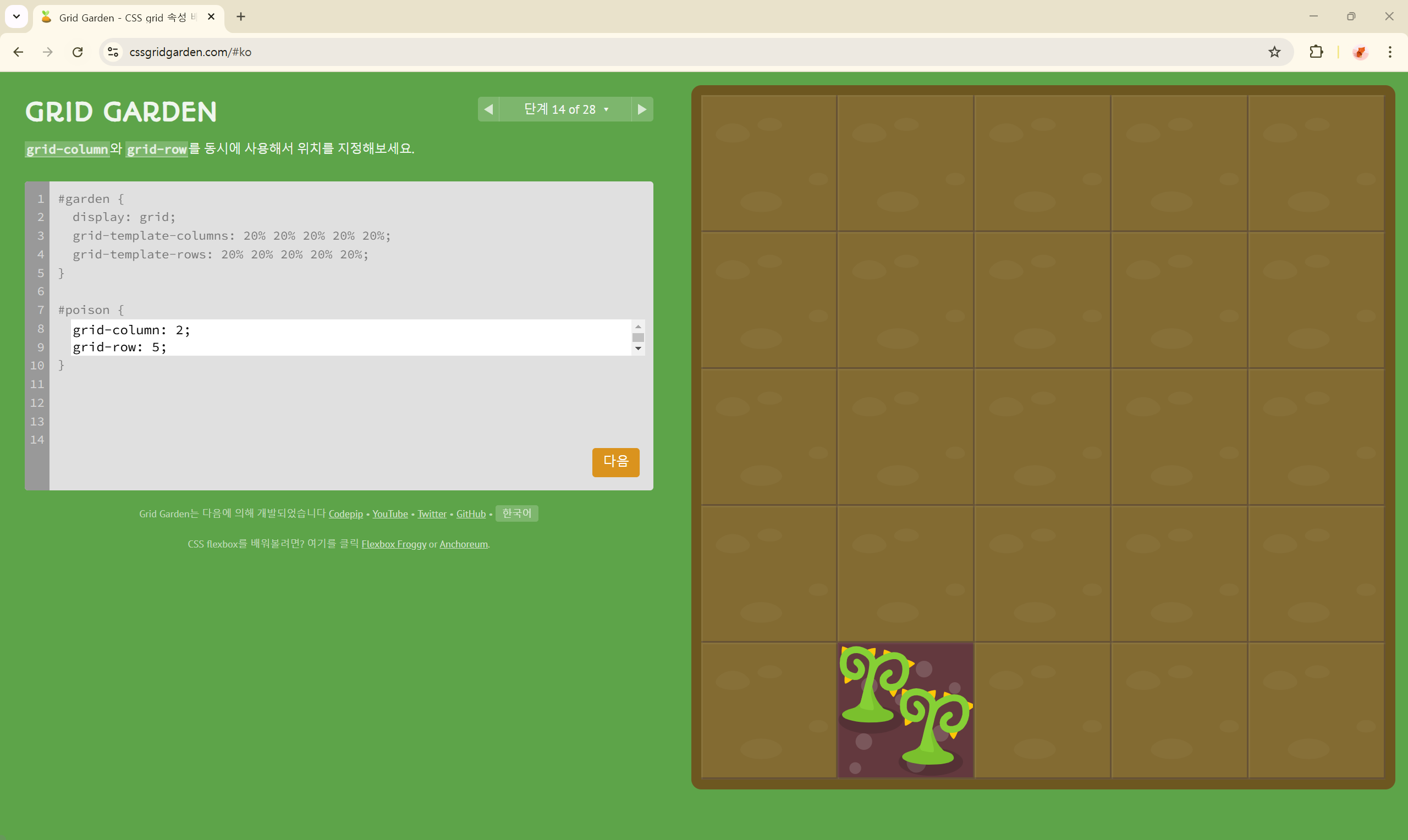
단계 15 of 28
grid-column: 2 / span 4;
grid-row: 1 / span 5;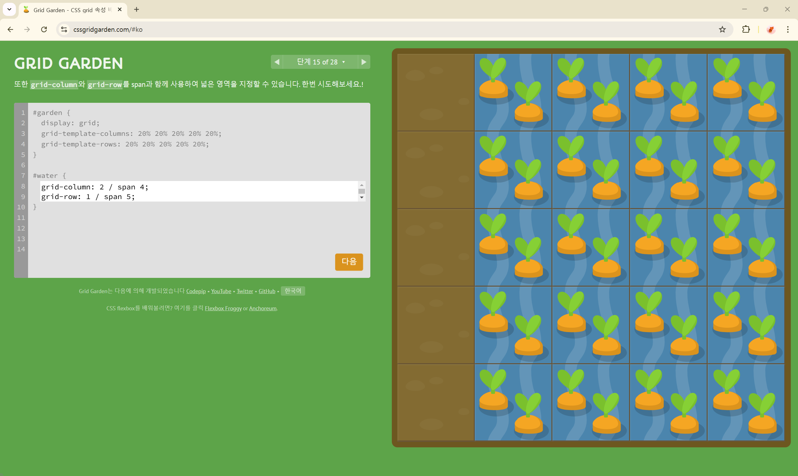
단계 16 of 28
grid-area: 1 / 2 / span 3 / span 4;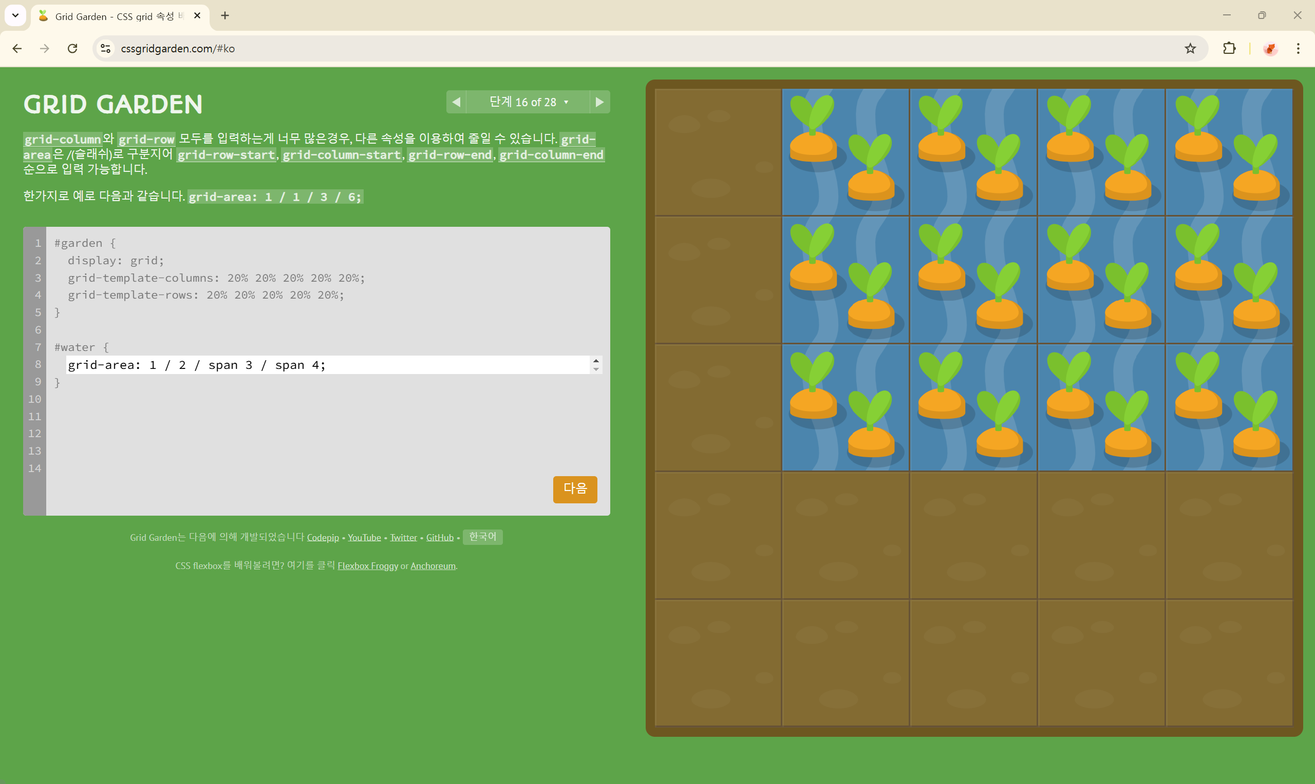
단계 17 of 28
grid-area: 2 / 3 / span 3 / span 3;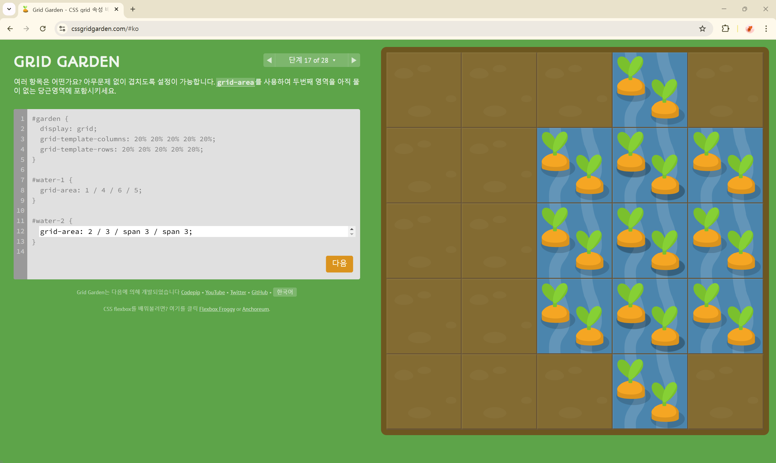
단계 18 of 28
order: 1;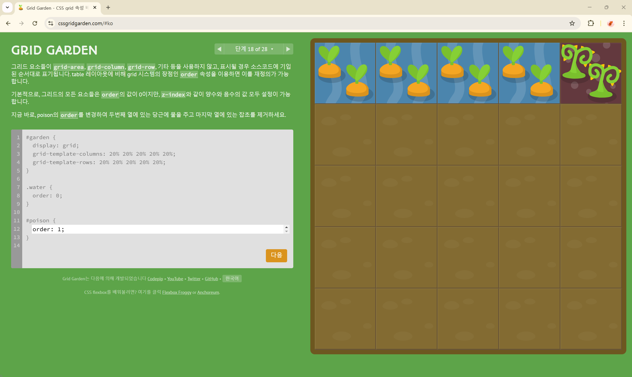
단계 19 of 28
order: -1;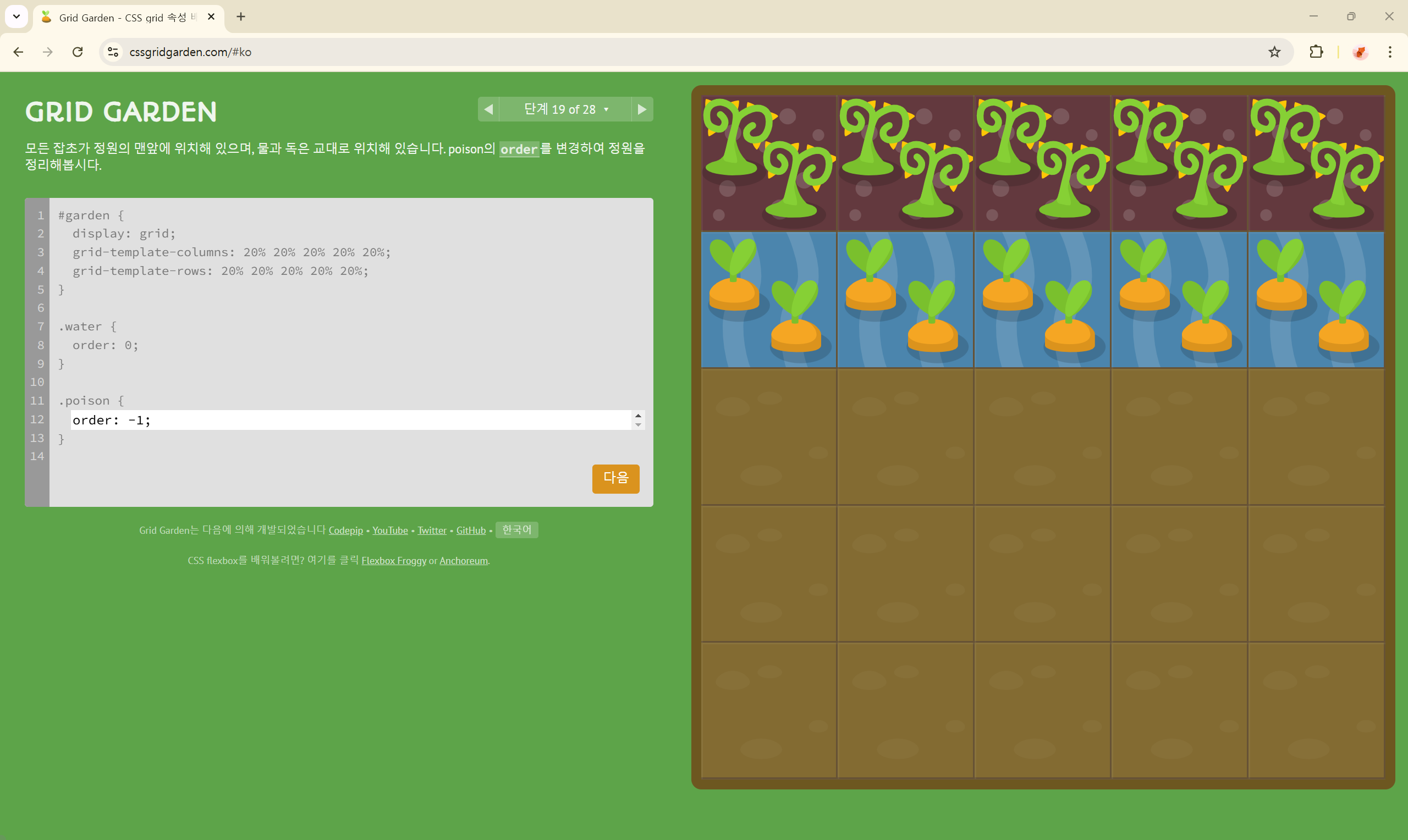
단계 20 of 28
grid-template-columns: 50% 50%;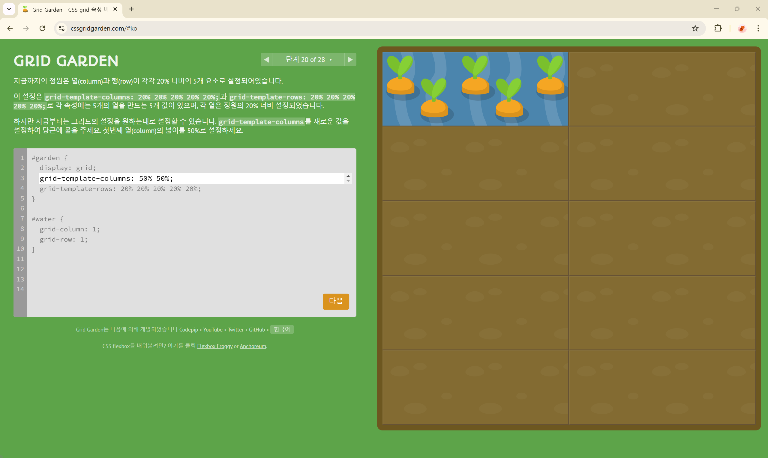
단계 21 of 28
grid-template-columns: repeat(8, 12.5%);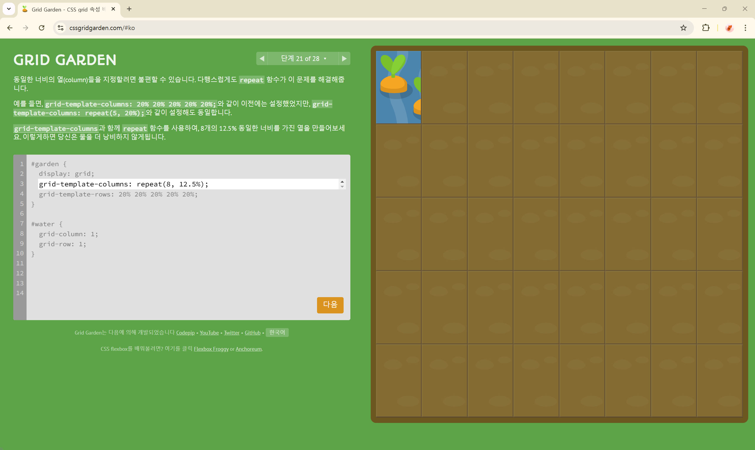
단계 22 of 28
grid-template-columns: 100px 3em 40% 1fr;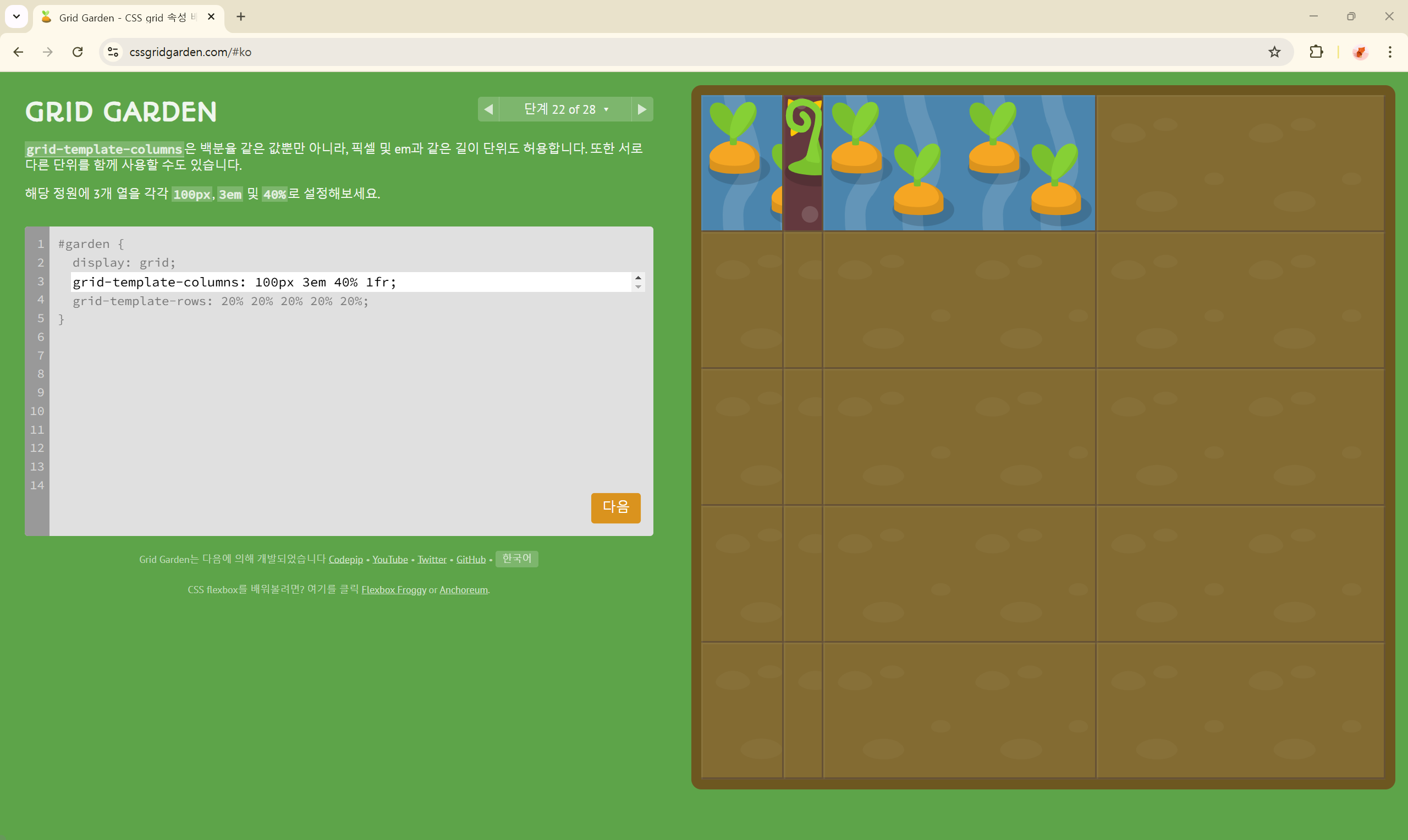
단계 23 of 28
grid-template-columns: 1fr 5fr;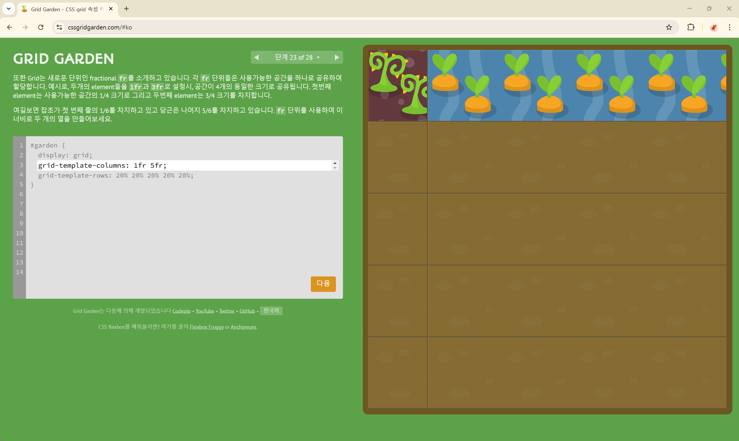
단계 24 of 28
grid-template-columns: 50px 1fr 1fr 1fr 50px;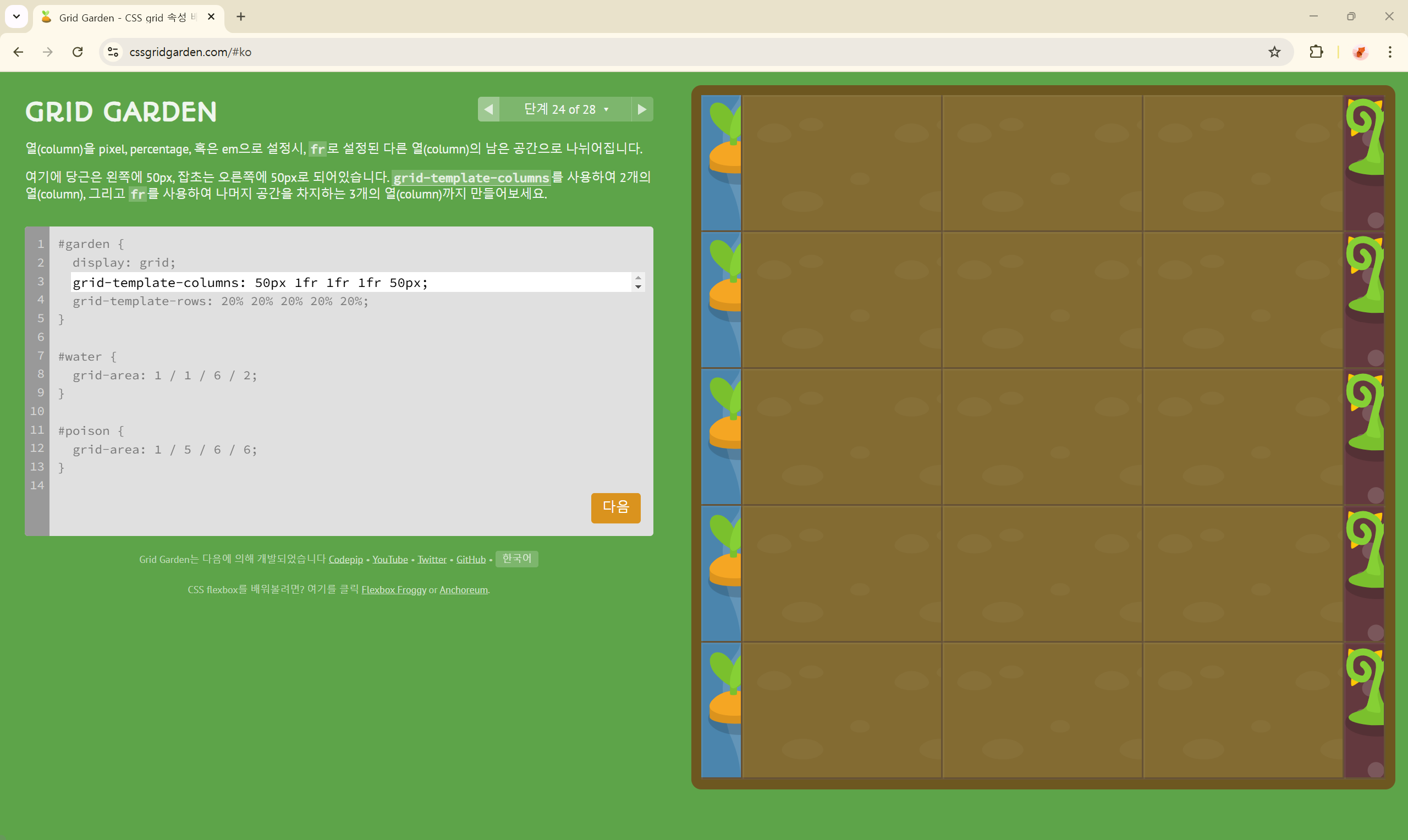
단계 25 of 28
grid-template-columns: 75px 3fr 2fr;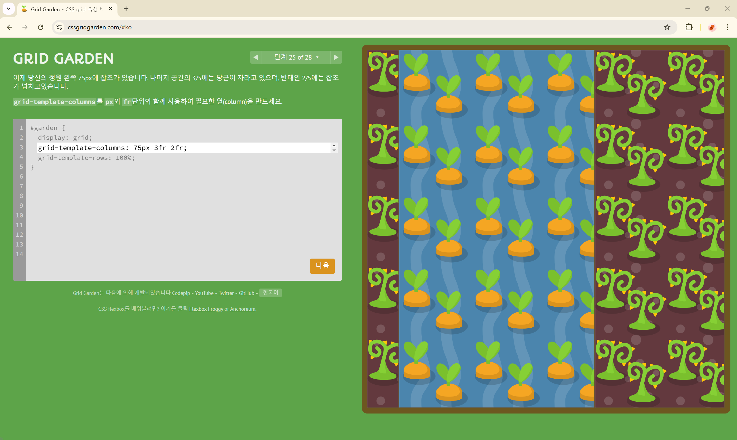
단계 26 of 28
grid-template-rows: 50px 0 0 0;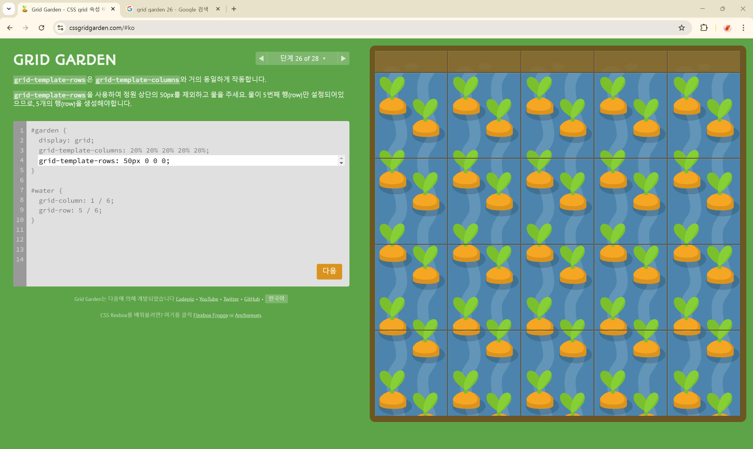
단계 27 of 28
grid-template: 60% 40% / 200px;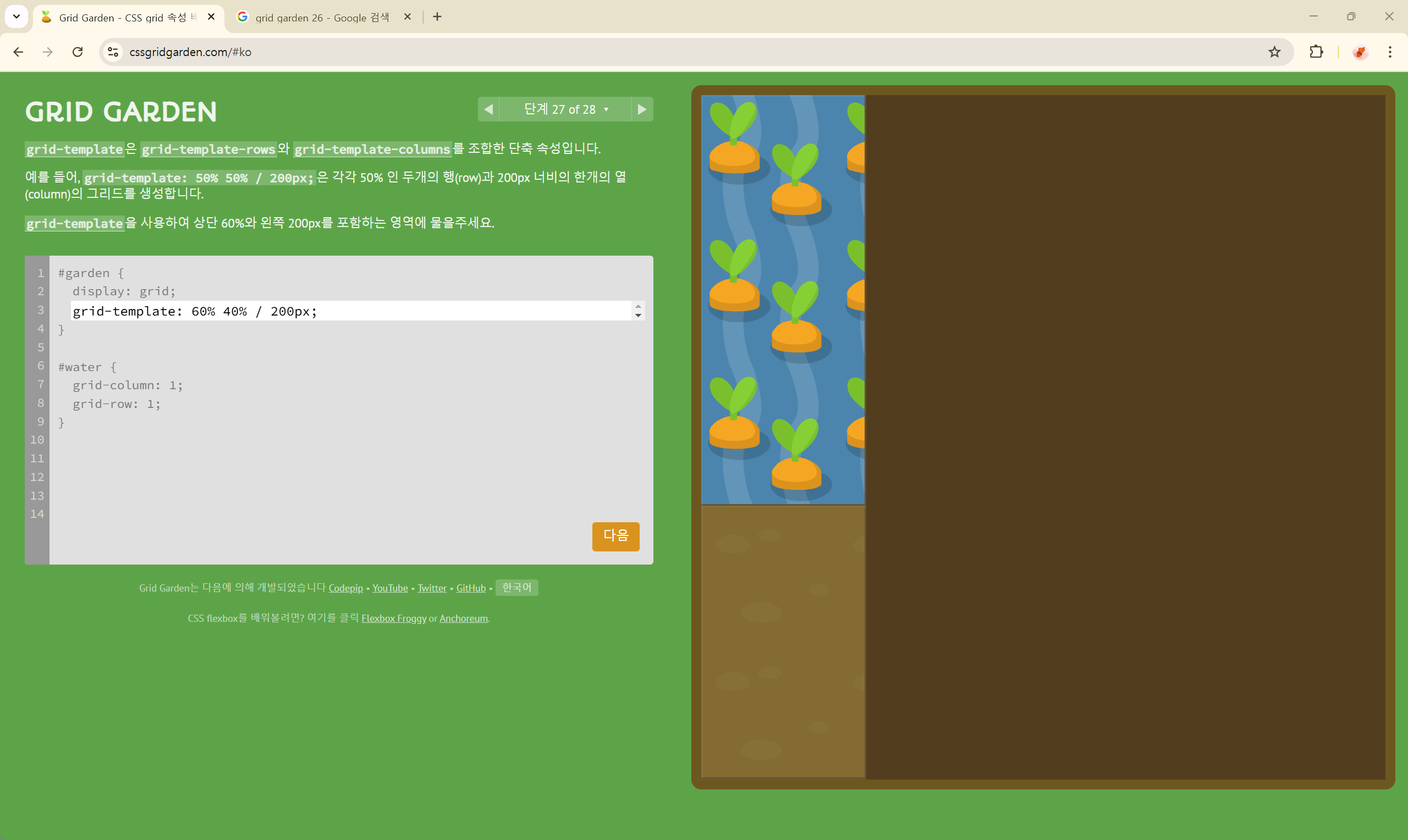
단계 28 of 28
grid-template: auto 50px / 20% auto;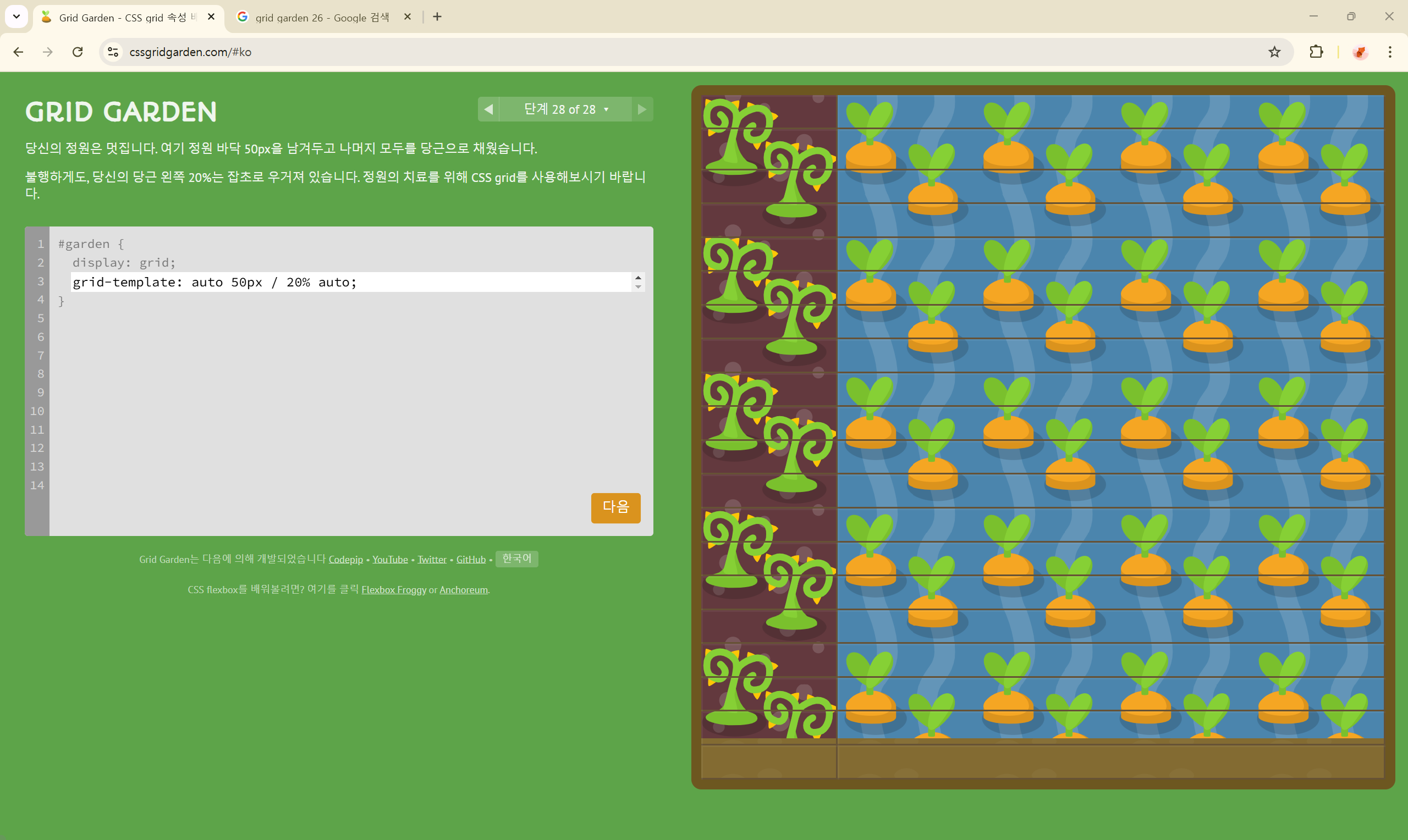
728x90
반응형
'개발 > CSS' 카테고리의 다른 글
| CSS Flex와 Grid에 대해 잘 정리해 놓은 블로그 추천 🌟 (0) | 2024.12.01 |
|---|---|
| Flexbox Froggy 정답 🐸 (0) | 2024.11.05 |